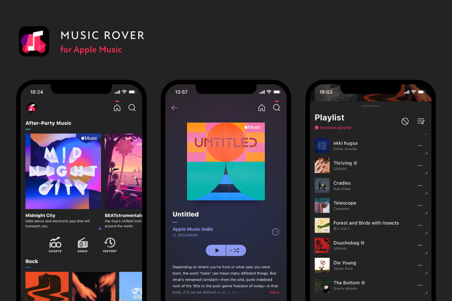
I have recently released Music Rover, an app for iOS to find your favorite songs from Apple Music.
[Free] Download from App Store
This is an app that I would like you to use when you want to find any good songs on Apple Music.
Click here to learn more about the features and functions of the application.
What this application aims to achieve
I am a frequent user of Apple Music and use it frequently to check for songs I like. I felt that although the default iOS Music app is highly functional and can display a variety of content, it may be difficult to get to each function because it combines all music-related matters into one.
Also, since this service allows users to listen to a very large number of songs, we wanted to create an application that specializes in exploration so that users can enjoy searching for music they have not yet heard.
Particular emphasis is placed on the playback queue and the station function.
Playback queue
The iOS default music app has only one playback queue, which is intelligently controlled, but when you want to listen to a variety of songs, you may unintentionally change the contents of the queue. Therefore, Music Rover provides multiple queues and allows you to switch between them so that you can easily listen to the songs you are interested in.
Station function
The station feature is like a radio that automatically selects songs based on a specific song or artist, and is one of the most useful features of Apple Music. Stations can be pre-created, or you can create your own stations based on your favorite songs.
I personally love to find my favorite songs in this self-created station, but it is not very prominent in the standard iOS Music app. So we have made it possible for you to start a station right away in Music Rover. If you have never created a station before, please give it a try.
About UI design
Music Rover’s UI was designed with the theme of displaying songs in a way that makes people want to find them.
The home screen is laid out in such a way that it is not cramped while displaying each content in a relatively small size to give the impression that there is a variety of music.
In addition, artwork is displayed as squares without rounded corners. Currently, many music apps display artwork with rounded corners, but for some artwork, this may not be a good result because the corners are cut off. We have adopted the square format to emphasize the importance of displaying artwork neatly.
On the album and playlist detail screens, the background, title, button colors, etc. are displayed a little differently for each work based on the artwork. Some artwork may change considerably, so we hope that you will enjoy not only listening to songs, but also enjoying the appearance of the artwork.
About the technology used
Music Rover is implemented using the following
SwiftUI
I implemented it with SwiftUI 3 because the app targets iOS 15 and above, and I was able to implement it without too many problems. I used SwiftUI for everything except for features that iOS only has in UIKit (such as AVRoutePickerView).
I found SwiftUI to be quite easy to create UI compared to UIKit.
There are still some compromises that cannot be made with SwiftUI, but I still like it very much because it is easy to make minor adjustments and commonality.
MusicKit
For integration with Apple Music, I used MusicKit, which has been available since iOS 15. Although there was not much information on this new mechanism and it took some time to understand how to use it, I feel that the amount of implementation was considerably reduced compared to calling the Apple Music API directly. In particular, the simplification of authentication and the fact that MusicItemCollection supports pagination were very useful.
iOS 16 adds functionality to MusicKit, which I hope to incorporate in Music Rover in the future.
The Composable Architecture
The Composable Architecture (TCA) is a framework for building applications, and since I personally use Redux for web development, I decided to adopt TCA because of its similar concepts.
I may have implemented some parts in a bad way due to my lack of understanding of how to deal with them. However, I like it because it is easy to manage the state of the system and allows development in a unified manner.
Especially in SwiftUI, I am sometimes aware of re-rendering for better performance, and I was able to improve that area by making good use of TCA’s State (e.g., splitting State and creating ViewState).
About interface icons
I used Phosphor for the interface icons. I liked the clean look of these icons and the ease of converting them to custom SF Symbols because some of them are composed of lines.


